


AI SEO Agency: The Complete Guide to SEO, GEO & AEO
Ballistic Content Team
Read more


In the rapidly evolving landscape of financial technology, websites have become the first—and often only—touchpoint for users interacting with fintech products. As consumers grow more comfortable managing money online, the demand for seamless digital experiences has skyrocketed. A fintech company’s website is not just a digital storefront; it’s a critical gateway to trust, credibility, and ultimately, conversion.
Unfortunately, despite the growth and sophistication of the fintech sector, many companies still fall into avoidable traps when designing and managing their websites. These mistakes can undermine user trust, hinder conversion rates, and expose firms to compliance risks. From poorly structured navigation to compliance oversights, the spectrum of issues is broad—but not insurmountable.
Understanding these common pitfalls is essential for fintech companies looking to deliver secure, engaging, and user-friendly digital experiences. Whether you're launching a new fintech product or optimizing an existing platform, being aware of these mistakes can help your team avoid costly missteps.
This article explores five of the most common fintech website mistakes and offers practical guidance on how to steer clear of them. Drawing insights from UX design, regulatory best practices, and industry case studies, we aim to equip product managers, designers, and developers with actionable advice for building better fintech websites.
First impressions matter. In fintech, where trust and transparency are paramount, a website must do more than look attractive. It must perform flawlessly, communicate clearly, and provide reassurance at every stage of the user journey. A clunky or confusing website design can instantly derail interest, especially when users are asked to share personal or financial data.

Successful fintech platforms leverage their websites not only to inform but also to onboard and convert. This means the layout, language, and load speed all need to be finely tuned to align with user expectations. Clarity, consistency, and professionalism are non-negotiable in an industry where the stakes are as high as users’ financial security.
Trust is the cornerstone of any financial relationship. In traditional banking, trust was often built through in-person interactions and long-standing reputations. In fintech, websites must bear the full weight of that expectation. Visitors will decide in seconds whether your platform looks credible, secure, and worth their time.
Design elements such as clear call-to-action buttons, visible security badges, and intuitive layouts significantly influence this perception. Missteps—even seemingly minor ones—like inconsistent branding, ambiguous copy, or broken links can erode confidence before the first account is created or transaction completed.
By recognizing the website as a primary trust vehicle, fintech brands can start to prioritize the elements that matter most to their users. This sets the stage for long-term engagement, lower churn, and stronger customer loyalty.
In the fintech space, where clarity and trust are crucial, website navigation must be intuitive and user-centric. However, many fintech companies overlook the importance of a well-organized navigation structure. Instead of guiding users efficiently to their desired destinations, confusing menus and cluttered interfaces often lead to frustration and drop-offs.

When a user lands on a fintech website—whether to explore services, open an account, or seek support—they expect to find information quickly and easily. If they struggle to understand where to go or how to complete a task, chances are they'll abandon the site entirely. This not only results in lost opportunities but also damages the brand's reputation.
Users navigating a fintech website often arrive with specific goals: checking interest rates, learning about investment options, or signing up for a new financial product. These are sensitive actions that demand both mental clarity and emotional confidence. Complex or overloaded navigation undermines that trust by creating doubt—if a user can’t even find what they’re looking for, how can they feel confident entrusting the company with their finances?
Moreover, users often judge the credibility of a fintech service within the first few seconds of visiting a website. A confusing navigation experience signals a lack of professionalism and attention to detail, both of which are red flags when it comes to financial services. Clean, intuitive navigation, on the other hand, sends a clear message: this is a well-run, trustworthy platform that respects your time and needs.
Fintech websites tend to fall into several common traps when it comes to navigation:
Each of these issues adds friction to the user experience. The more effort it takes to understand the site, the less likely users are to continue exploring or convert.
The key to avoiding navigation issues lies in simplicity and structure. Start by defining your core user journeys—what do users come to your site to do? Build your navigation around these goals. Limit top-level menu items to a manageable number, ideally no more than five to seven. Use clear, descriptive labels that make it obvious what each section contains.
Group related pages under intuitive categories and avoid hiding essential features behind too many clicks. Include a prominent and clickable company logo that links back to the homepage. For fintech sites, it's also a good idea to highlight security, help, and login areas clearly, as these are high-priority for most users.
To ensure your navigation is as effective as possible, consider using tools such as:
These tools provide valuable insights into how users interact with your website and where they may be getting stuck. Use this data to iterate and refine your navigation regularly, ensuring that it evolves alongside your product and audience needs.
One of the most damaging oversights a fintech company can make is failing to reassure users that their information and money are secure. Security isn't just about technical safeguards—it's also about communicating safety through your website’s design and language. Without visible trust signals, even the most secure platform can feel unsafe to users.
In fintech, where data sensitivity and financial risk are high, building user trust starts the moment someone lands on your website. If your site lacks clear visual cues that it’s secure and compliant, users may hesitate to engage, sign up, or complete transactions.

Trust in digital platforms often hinges on small visual details that communicate professionalism, reliability, and transparency. Elements such as SSL certificates, data encryption badges, user reviews, and clear privacy policies serve as trust anchors. They assure users that your site has taken the necessary steps to protect their information.
Users, especially those less familiar with fintech tools, are quick to judge. A missing security icon, an outdated copyright notice, or a poorly written privacy policy can all create anxiety. Trust, once shaken, is difficult to restore—especially when dealing with financial services.
Designing for trust involves more than just back-end security. It’s about ensuring your users feel safe, informed, and in control throughout their journey on your site.
There are several visual and structural elements fintech companies should prioritize:
These features don’t just enhance security—they make users feel more confident about sharing personal data and engaging with the platform.
Leading fintech companies embed trust-building elements into every facet of their digital experience. For instance, PayPal maintains a prominent security center on its website, outlining the steps taken to protect users. Chime clearly communicates its FDIC insurance status and uses intuitive microcopy to guide users through identity verification processes.
Revolut provides transparent access to its fee structures, licenses, and regulatory oversight, reassuring users that they are dealing with a credible institution. Even visually, these brands use calm, professional color schemes and consistent fonts—subtle design choices that reinforce reliability.
It’s not enough to include security and trust signals—they need to be strategically placed. Display SSL badges near login and payment fields. Link to your privacy policy directly from the footer and onboarding screens. Use plain language to explain security procedures during sensitive steps, like ID verification or transaction approvals.
Consider adding visual aids like lock icons next to sensitive input fields. During sign-up or account access, include a brief statement such as, “Your information is encrypted and secure,” along with a link to more detailed documentation. These microinteractions can significantly ease user anxiety.
By placing trust elements exactly where users need reassurance, you proactively answer their concerns—often before they even think to ask.
In today’s fintech environment, where users demand instant access to their financial tools, poor mobile optimization is not just an inconvenience—it’s a deal-breaker. Mobile responsiveness determines whether users stay engaged or abandon your site entirely. With the majority of users now accessing financial services via smartphones, a desktop-first approach is no longer viable.
Yet many fintech websites continue to prioritize desktop designs, treating mobile optimization as an afterthought. This results in frustrating user experiences, broken layouts, and slow load times—all of which directly impact conversions, user satisfaction, and retention.

Fintech users often perform time-sensitive actions—checking balances, making payments, or managing investments—on the go. They expect seamless functionality across all devices, especially mobile. A mobile-unfriendly website that requires pinching, zooming, or excessive scrolling will quickly lose credibility.
Beyond usability, mobile responsiveness is now a ranking factor in Google’s search algorithm. This means that poor mobile experiences not only reduce conversions but can also lower your website’s visibility on search engines, costing you organic traffic and brand exposure.
Mobile optimization is about more than just adjusting screen sizes. It’s about rethinking content hierarchy, button sizes, and interaction flows to create a frictionless experience for smartphone users.
Fintech websites that fail to deliver a responsive mobile experience often see higher bounce rates, shorter session durations, and fewer conversions. Even seemingly small issues—such as buttons that are too close together, slow-loading graphics, or forms that don’t auto-adjust to screen size—can frustrate users enough to abandon their visit.
In financial contexts, these frustrations are amplified. Users dealing with sensitive financial data expect precision, speed, and comfort. If their first experience with your mobile site involves a broken button or a misaligned form, they’re unlikely to trust your platform with more important tasks like fund transfers or account creation.
Creating a responsive design requires more than using a flexible grid system. Fintech platforms should follow these best practices:
Fintech sites should also reduce cognitive load on mobile. For instance, limit the number of required form fields, break complex tasks into step-by-step processes, and include contextual help to support user comprehension.
There are several tools that can help evaluate and improve your mobile responsiveness:
Regular testing should be a part of your development and QA workflow. Fintech users are increasingly mobile-first, and ensuring a smooth mobile journey can drastically impact your brand’s trust and growth.
The onboarding process is the most critical stage of any fintech website. It's the point where interest turns into commitment—where a visitor becomes a user. Unfortunately, this is also where many fintech companies falter by presenting lengthy, unclear, or overly complex sign-up forms that overwhelm users and drive them away.
In a space that deals with sensitive financial data, clear and efficient onboarding is essential. If the process feels unnecessarily complicated, users may question the platform’s reliability, abandon their session, or seek alternatives that make things simpler.
Fintech users are often required to provide detailed personal and financial information. While these steps are necessary for regulatory and security purposes, the way they're presented can make all the difference.
A common mistake is dumping all required fields into a single, cluttered form without any guidance. Long forms with minimal feedback or explanation cause users to feel confused and uncertain. Even something as simple as a missing progress bar can make the process seem endless and discouraging.
In addition, vague or technical form labels, lack of validation feedback, and unexpected requests (like uploading documents too early in the journey) contribute to friction. Each obstacle increases the likelihood that users will abandon the onboarding process.

Several UX pitfalls often appear in fintech onboarding forms:
These issues create cognitive overload, especially for users unfamiliar with financial systems or digital onboarding procedures. In some cases, a poorly designed form can feel more like an interrogation than a helpful entry point into a valuable service.
Improving onboarding UX starts with simplifying the process and guiding users through it clearly and patiently.
Use progress indicators to break forms into manageable steps. These visual cues reassure users by showing how far they've come and how much remains. Add inline validation to prevent users from submitting incorrect or incomplete data, and offer immediate, helpful feedback when errors occur.
Incorporate concise, conversational microcopy next to complex questions. Explain why certain information is needed and how it will be used. This reduces anxiety and builds transparency. Autofill features, dropdowns, and default values can also reduce manual effort and streamline input.
Allow users to pause onboarding or save progress when possible. Not every user is ready to complete everything in one go, especially if document uploads or verifications are required. Giving them flexibility reduces abandonment and enhances satisfaction.
A few fundamental design principles can dramatically improve onboarding experiences:
Fintech onboarding should feel like a guided journey, not a test. By using thoughtful design and reducing friction, companies can significantly increase sign-up completion rates while reinforcing user confidence.
In the fintech industry, compliance is not optional—it is a legal obligation and a critical driver of user trust. Yet, many fintech websites still underplay or overlook regulatory requirements in their content, structure, and design. The result? Legal vulnerabilities, reputational damage, and lost customer confidence.
Transparency in how data is collected, stored, and used should be visible and accessible. Fintech websites that lack clarity on these fronts leave users uncertain about whether their information is being handled responsibly. For a sector grounded in privacy and financial security, that uncertainty can be fatal.
Often, the issue isn't the absence of compliance—but the poor communication of it. Even platforms with robust data protection policies may present them in legal jargon, bury them in footers, or fail to link them during key touchpoints such as sign-up or transactions.
Users looking for reassurance want to see clear, human-readable explanations about how their data is used and what protections are in place. When a website lacks this clarity, it raises red flags—even if the backend processes are fully compliant.
Furthermore, neglecting to inform users of required permissions (like geolocation or financial access) before asking for them creates a perception of overreach, which can erode trust quickly.

To meet both regulatory requirements and user expectations, a fintech website should visibly demonstrate its adherence to major compliance frameworks. Key indicators include:
These indicators show not only that a company takes compliance seriously but also that it respects user agency. That’s a powerful message in a space where trust and control are top priorities.
A common concern among fintech teams is that compliance elements might clutter the design or confuse users. But with thoughtful integration, legal transparency can become a natural part of the user experience.
Place essential policies in the footer of every page, but also include contextual references throughout the site. For example, during form submissions, link to your privacy policy when asking for identity or financial information. When using cookies or tracking tools, use clear banners with straightforward choices—avoid default consent.
During onboarding, explain why you need certain data with a short description and an optional “Learn More” link. If your platform is regulated by financial authorities, mention it prominently. These small additions reinforce trust without overwhelming the interface.
Each regulation presents different challenges, but all require careful attention on the website:
Use plain language, helpful icons, and expandable sections to make this information digestible. Even a simple FAQ that answers questions like “Why do you need my ID?” or “How is my data stored?” can bridge the gap between compliance and user understanding.
By integrating legal transparency into the website experience—not hiding it—fintech companies can improve user trust and meet regulatory obligations simultaneously.
Even the most visually appealing and secure fintech website can fall short if its calls-to-action (CTAs) fail to inspire user engagement. CTAs are the turning points of your website—buttons and prompts that direct users to sign up, explore services, or begin transactions. When they are generic, unclear, or poorly placed, conversion rates suffer.
In fintech, where the stakes are higher than a simple newsletter subscription, CTAs need to do more than just invite clicks. They need to build confidence, signal urgency, and provide clear value—all while fitting seamlessly into the broader user experience.
Fintech users are often cautious. They're making decisions that involve money, identity verification, and long-term commitment. A weak CTA like “Submit” or “Click Here” doesn’t provide enough motivation or assurance. In fact, it may create doubt—what exactly happens after the click?
Effective CTAs for fintech platforms go beyond commands; they communicate outcomes. For example, instead of saying “Start Now,” a better CTA might be “Create My Free Investment Account” or “Compare Credit Options Instantly.” These versions not only direct action but also reinforce the value users will receive.
Urgency, when used appropriately, can also increase conversions. Phrases like “Get Started in 60 Seconds” or “No Credit Card Required” reduce friction and nudge users toward immediate action without pressure.
Here’s a quick comparison to illustrate the impact of wording and placement:

Small changes in phrasing can significantly shift user perception from generic to specific, from ambiguous to reassuring.
An effective CTA doesn’t just rely on strong copy—it also requires thoughtful design and positioning. Here are some essential best practices:
Well-designed CTAs create a smoother, more persuasive user journey. They guide users with confidence, reduce hesitation, and encourage action—all of which are essential in converting visits into lasting relationships.
For fintech websites, performance and search visibility aren’t just technical concerns—they are business imperatives. A slow-loading site or poorly optimized content can reduce trust, hurt your search engine rankings, and result in lost revenue opportunities. Yet, many fintech platforms still treat SEO and performance as afterthoughts, rather than integral parts of the design process.
In a competitive industry where cost-per-click can be high and organic traffic is essential for scalable growth, avoiding these mistakes is key to both user satisfaction and financial performance.
Speed and accessibility are more than user experience enhancements—they directly influence SEO rankings and user behavior. Studies consistently show that users abandon websites that take more than three seconds to load. In fintech, this impatience is compounded by the sensitive nature of the content: users are less forgiving when accessing their money, accounts, or personal information.
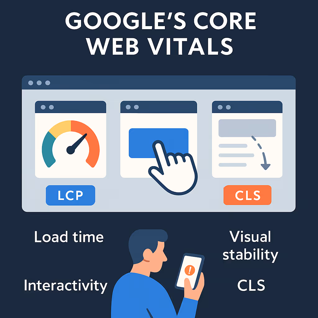
Google's Core Web Vitals—measuring load time (LCP), interactivity (FID), and visual stability (CLS)—are now part of the ranking algorithm. If your website performs poorly on these metrics, you risk lower rankings and fewer inbound visitors.
Accessibility is another often-overlooked aspect. Fintech companies must ensure that users with disabilities can access content, complete transactions, and navigate the site with ease. This includes supporting screen readers, providing keyboard navigation, and using alt text for images. Not only is this a best practice—it may also be a legal requirement, depending on your region.
Several recurring SEO mistakes can be found across fintech websites:
These issues reduce search engine visibility, hurt user trust, and often correlate with lower engagement rates. For example, if Google can’t crawl your pricing or product comparison pages due to poor site structure, your visibility for high-intent searches will plummet.
Addressing performance and SEO requires a collaborative effort between design, development, and content teams. Here are key strategies for improvement:
Fintech websites that invest in technical SEO and performance optimization enjoy higher visibility, faster conversions, and greater trust from users and search engines alike.
A fintech website is more than just a digital asset—it's the foundation of user trust, engagement, and long-term success. As users increasingly turn to online platforms for their financial needs, the importance of delivering a seamless, secure, and user-centric experience cannot be overstated.
Avoiding common fintech website mistakes like poor navigation, weak trust indicators, mobile unfriendliness, clunky onboarding, and neglecting compliance doesn't require massive overhauls. Instead, it demands thoughtful, user-first design backed by regulatory awareness and technical excellence. Each of these elements contributes to a more credible, efficient, and competitive platform.
Ultimately, the fintech companies that thrive are those that treat their websites as living, evolving tools—not one-time projects. They invest in continuous improvement, listen to user feedback, and partner with experts who understand both design and the unique demands of financial technology.
If you're ready to elevate your fintech website and build an experience that users trust and enjoy, it's time to bring in the professionals. Ballistic Design Studio specializes in creating high-performing, conversion-driven fintech websites. Their expertise in UI/UX, compliance-friendly layouts, and performance optimization ensures your brand makes the right first impression—every time.
Let your website be your greatest asset, not your biggest liability.
Fintech websites often fail to simplify user flows, resulting in confusing navigation, overcomplicated forms, and non-intuitive layouts. These issues erode trust and cause users to abandon the site before converting.
Add visible trust signals like SSL certificates, compliance badges, customer reviews, and clear privacy policies. Use professional design, consistent branding, and transparent copy to reassure users.
Both are important, but mobile optimization is now critical. The majority of users access fintech services via smartphones. If your site doesn't work well on mobile, you risk losing a large segment of your audience.
Users expect to see SSL encryption, visible security badges, transparent pricing, and clear explanations of how their data is used. Compliance indicators and user testimonials also play a key role.
Work with legal and compliance professionals during design. Clearly display required policies, use opt-in consent mechanisms, and follow regional laws like GDPR, PSD2, and CCPA where applicable.
Ideally, your page should load in under 3 seconds. Faster sites improve user satisfaction, reduce bounce rates, and rank better in search engines—particularly critical in the financial space.
Absolutely. Ballistic Design Studio offers specialized fintech design services tailored to your industry’s unique needs. Whether you're building from scratch or refining an existing site, they deliver results that convert and inspire trust.


Only valid for-