


AI SEO Agency: The Complete Guide to SEO, GEO & AEO
Ballistic Content Team
Read more


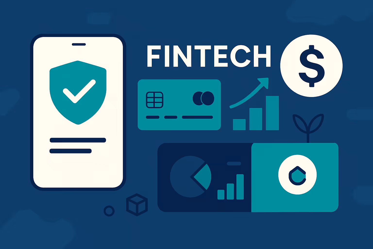
The fintech industry in 2025 is more dynamic and competitive than ever before. With top fintech companies, digital-only banks, payment platforms, investment apps, and even AI-driven financial tools flooding the market, the landscape has matured into a high-stakes battleground. In India alone, the fintech India ecosystem continues to surge, supported by UPI, modern banking rails, and a rapidly growing population of digitally confident users.
Global fintech adoption too, is accelerating. Consumers now expect instant payments, smart insights, and seamless online experiences—whether they’re using established brands or new fintech startups. At the same time, AI in fintech is reshaping fraud detection, personalization, credit scoring, and customer service, raising user expectations even further.
The global fintech ecosystem is evolving rapidly, but fintech India has become one of its strongest growth engines. With a massive digital-first population, affordable mobile data, and government-backed innovations like UPI and Aadhaar, India has become a launchpad for both local and international fintech startups.
At the same time, top fintech companies around the world are investing heavily in AI in fintech, enabling smarter automation, real-time risk management, and hyper-personalized user journeys.

Users today are also more cautious and better informed, with a strong preference for simplicity, personalization, and a responsive design. A 2024 study revealed that fintech apps incorporating these UX principles significantly boosted both user engagement and retention. In other words, a clunky interface, unclear messaging, or slow-loading pages can lose users in seconds.
Moreover, consumer trust in financial platforms hinges on digital security and usability. People are understandably guarded about sharing personal or financial information online. As a result, fintech companies must go beyond offering great products; they must reassure users from the very first interaction.
This is where a high-converting fintech website plays a critical role. It must do more than explain what your product does—it needs to guide visitors smoothly through a conversion journey, from simply signing up to completing a transaction, all while delivering speed, precision, and clarity of intent.
Whether you're launching a new fintech startup or rebranding an established platform, aligning your website design and strategy with modern user expectations is no longer optional—it’s essential. A well-structured, high-performing website can significantly elevate your brand, foster trust, and drive measurable growth in a highly regulated, rapidly evolving industry.
In the following sections, we'll dive into actionable steps for creating a fintech website that doesn’t just look great, but converts effectively in 2025’s digital marketplace.
When a visitor lands on your website, their first impression is formed in milliseconds. In the fintech space, where trust and credibility are paramount, that initial reaction can be the deciding factor between a bounce and a conversion. Every design choice you make—colors, imagery, layout, typography—contributes to how your brand is perceived.
A professional, cohesive visual identity signals that your brand is legitimate and reliable. Consistent use of brand colors, typography, and iconography across your site reinforces brand recognition and creates a sense of stability. Visual clutter or inconsistent styling, on the other hand, can erode trust quickly.
Leading top fintech companies follow strict design systems that communicate trust in seconds. Whether you’re competing in fintech India or the global market, your visual identity must instantly signal reliability—users judge credibility long before they read your product details.
Choosing the right color palette is particularly important in financial services. Colors like blue, for example, are often associated with trust and security, while clean, white space can make your interface feel modern and user-friendly. Keep the design focused and minimalist, allowing key messages and calls to action to stand out without overwhelming the user.
Imagery plays a powerful role in storytelling, but in fintech, it must be used with intention. Avoid generic stock photos that feel disconnected from your audience. Instead, opt for visuals that reflect your target users and illustrate your product's value. This could include lifestyle images, product mockups, or custom illustrations that convey ease of use and innovation.
Videos can be especially effective for complex products. A brief explainer or customer testimonial can build understanding and trust more quickly than paragraphs of text. Just be sure all media assets are optimized for fast loading and mobile responsiveness to maintain performance.
In 2025, a slow website is a dead website. Users expect near-instant page loads—anything beyond three seconds significantly increases bounce rates. Site speed is not only a user experience concern but also a ranking factor in search engine optimization, which is vital for visibility in the competitive fintech market.
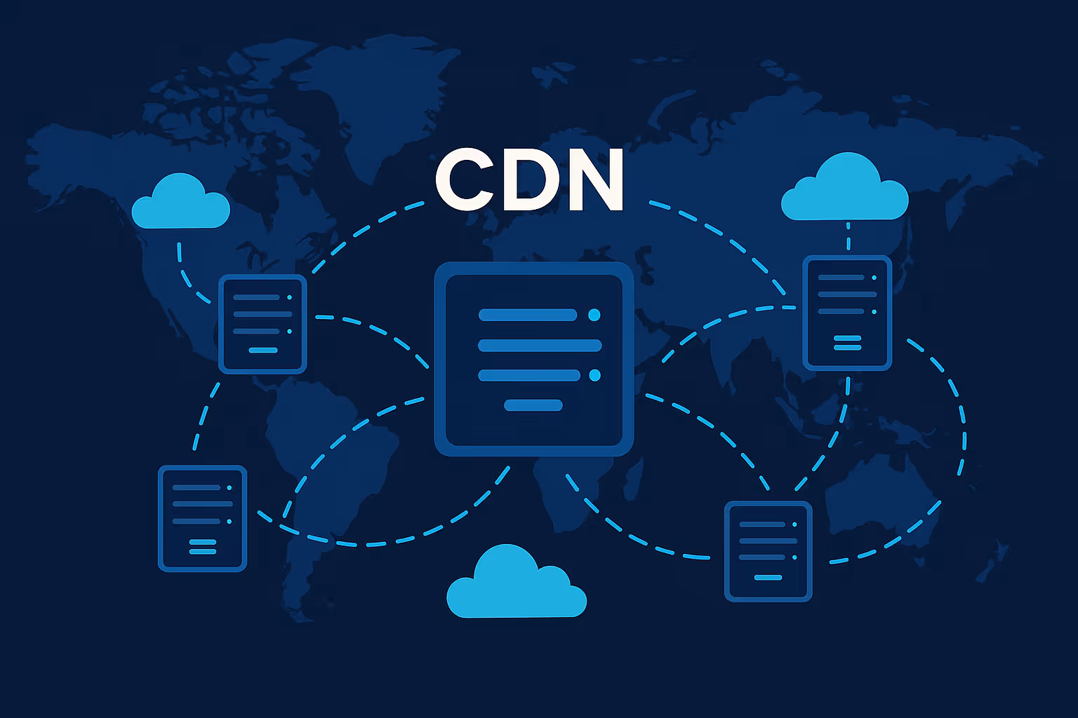
To ensure fast load times, use compressed images, minimize unnecessary scripts, and leverage modern content delivery networks (CDNs). Mobile optimization is equally critical. With most users accessing fintech platforms via smartphones, your site must be responsive, intuitive, and easy to navigate on smaller screens.
Designing for trust is not just about aesthetics—it's about sending the right signals, reducing user friction, and creating a consistent, reassuring experience from the moment someone visits your homepage. When done right, your design becomes a silent yet powerful tool in converting visitors into loyal users.
In fintech, gaining a user's confidence is half the battle. Unlike other industries where aesthetics or novelty might drive conversions, financial services demand a deeper layer of trust. Every part of your website should contribute to reducing uncertainty and encouraging users to take the next step with confidence.

One of the most common mistakes fintech companies make is overloading their website with industry jargon or overly technical language. While it's important to demonstrate expertise, clarity should never be sacrificed. Users should be able to understand what your product does, how it benefits them, and why they should care—all within a few seconds of arriving on your site.
Using plain, accessible language not only improves user comprehension but also makes your brand feel more approachable. Even for sophisticated B2B fintech platforms, simplifying language shows that you respect your users' time and intelligence.
Keep sentences short and active. Use bullet points and headings to break down complex information. When technical terms are necessary, offer brief explanations or use contextual tooltips to ensure clarity without clutter.
In the digital finance world, trust and security go hand in hand. Users want to know their data is safe, and your website should communicate that clearly. Displaying security badges such as SSL certificates, data encryption standards, and compliance with regulations like GDPR or PCI-DSS can provide instant reassurance.
Security expectations have evolved because users interact with global fintech platforms daily. Whether they’re using banking apps, trading platforms, or local fintech startups, the baseline expectation is enterprise-grade security backed by transparent communication.
Privacy policies and terms of service should be easily accessible, but more importantly, they should be written in understandable language. Including these elements in the footer or checkout flow shows that your company takes compliance and user protection seriously.
Trust signals can also include secure login features, multi-factor authentication indicators, and user account protections. Small details like lock icons near form fields or phrases like “your data is safe with us” can subtly reinforce security without being intrusive.
Consistency breeds confidence. When your visual elements, tone of voice, and navigation patterns remain the same throughout the site, users are more likely to trust the experience. Inconsistent design or messaging, on the other hand, can raise red flags and cause doubt.
This extends beyond aesthetics to the way information is presented. Button styles, form layouts, CTA phrasing, and even micro-interactions should follow a consistent pattern. If a user sees one style of CTA on the homepage and a completely different one on the pricing page, it creates unnecessary cognitive load.
The more predictable and cohesive your site feels, the easier it is for users to navigate and engage with confidence. When combined with clear messaging and strong security cues, consistency turns your website into a powerful trust-building asset—one that encourages conversions without ever having to ask for them directly.
Designing a fintech website that converts is more than just visuals and fast load times. It’s about understanding how users move through your site—from the moment they land to the moment they sign up or take another meaningful action. This journey, commonly referred to as the conversion funnel, must be carefully structured to guide users intuitively and reduce friction at every step.
Strong funnels are one of the biggest differentiators between average fintech websites and those built by top fintech companies and fast-growing fintech startups. These brands succeed because their funnels are simple, intuitive, and backed by insights powered by AI in fintech, especially during onboarding and risk checks.
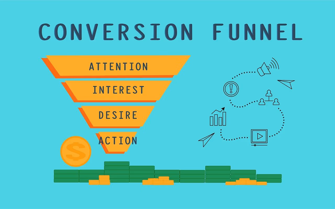
The top of the funnel is all about attracting and engaging new visitors. This is where first impressions and clear messaging matter most. Your homepage and landing pages should clearly communicate your unique value proposition, highlight key benefits, and offer users a reason to explore further.
As users move deeper into your site, they transition into the interest and consideration phases. Here, they want more information—how your platform works, what others think about it, and how it compares to alternatives. This is where elements like feature breakdowns, demo videos, testimonials, and FAQs play a crucial role.
Finally, the bottom of the funnel is about action. Whether your goal is to encourage a sign-up, schedule a demo, or start a free trial, the path to conversion should be clear and convincing. At this stage, every detail—from button color to trust badges near forms—can influence a user’s decision.
Call-to-action buttons are among the most critical elements in a high-converting fintech website. Each CTA should be specific, benefit-oriented, and placed strategically throughout the user journey. Phrases like “Get Started,” “Open an Account,” or “Start Saving Today” are clear and action-driven, making it easy for users to know what happens next.
For more complex processes—such as onboarding, loan applications, or investment profile creation—use progress indicators. These visual cues help users understand how many steps remain and give them a sense of accomplishment as they advance. This reduces abandonment and keeps users motivated.
Placement is just as important as wording. CTAs should be visible without overwhelming the user. They should appear consistently across key pages and be paired with supportive microcopy that explains the benefit or assures the user of safety.
One of the biggest conversion killers in fintech is over-complicated sign-up processes. Asking for too much information too soon can deter users who are still in the consideration phase. Aim to collect only essential information at the start, such as name and email, and save additional details for later in the onboarding process.
Use autofill where possible, provide real-time validation for inputs, and add microcopy that explains why each field is needed. For example, instead of a vague label like “Phone Number,” include context like “Used to verify your identity securely.”
Consider offering social sign-in options or single sign-on integrations to simplify the process. The easier it is to get started, the more likely users are to complete the conversion.
Building a seamless, intuitive funnel structure helps ensure users aren’t just visiting your site—they’re moving through it with purpose. When the path to conversion feels logical, frictionless, and reassuring, the result is a higher percentage of visitors turning into customers.
In a fintech website, content does far more than inform. It educates, reassures, and persuades visitors to take meaningful steps—whether that’s signing up, making a payment, or contacting sales. Great content doesn’t just tell users what your product does; it shows them how it solves real problems and fits into their lives.
The headline is often the first piece of content a visitor reads, and it needs to do heavy lifting. Instead of listing features, effective fintech websites use headlines to highlight outcomes. Rather than “Advanced Financial Management Tools,” consider something like “Take Control of Your Finances in Minutes.” This shifts the focus from what the product is to what the user gains.
Strong headlines are specific, emotionally resonant, and often contain a number or a time frame to add urgency or clarity. A phrase like “Save 20% More Every Month with Automated Budgeting” gives users a clear reason to keep reading or click through.
This principle applies not only to homepages but also to landing pages, product sections, and even CTA banners. Every heading is an opportunity to reinforce value.
Users are far more likely to engage with content that feels tailored to their needs. Personalization can range from dynamic content blocks based on user segments to suggested next steps based on past behavior. For example, if a visitor browses retirement planning features, showing them case studies or resources related to long-term investments increases relevance and engagement.
Even without complex backend personalization, you can create targeted content for different user personas. This might include separate landing pages for students, business owners, or first-time investors, each with messaging that speaks directly to their concerns and goals.
Well-structured user journeys combined with personalized messaging make visitors feel understood, which builds trust and improves conversion rates.
Fintech products can often be complex. Rather than relying solely on static paragraphs to explain how your offering works, use interactive tools to demonstrate value. Financial calculators, sliders, comparison charts, and onboarding walkthroughs help users explore features on their own terms.
Additionally, educational resources—such as blog articles, guides, or explainer videos—can position your brand as a trusted advisor. This type of content not only supports SEO but also assists in nurturing visitors who aren’t ready to convert immediately. For users in the consideration phase, educational content bridges the gap between interest and decision-making.
Making content actionable means giving users the information they need in the format they prefer. Whether it's through well-crafted headlines, smart personalization, or engaging tools, your content should always work toward the goal of moving users further down the funnel.
With more than half of web traffic now originating from mobile devices, a mobile-first approach is no longer optional—especially in fintech, where users increasingly manage their finances on the go. Whether it's checking account balances, transferring money, or applying for credit, users expect the same speed, functionality, and trust on a smartphone as they would on a desktop.

A mobile-first strategy starts by understanding the user’s context. On smaller screens, every element must earn its place. Navigation should be intuitive and minimal—hamburger menus, sticky headers, and collapsible sections help maintain functionality without overwhelming the user.
Touch targets should be thumb-friendly, meaning buttons and links must be large enough and spaced well to avoid accidental taps. Forms should adapt to mobile keyboards and use proper input types (e.g., number pads for phone fields or card details). These seemingly small details significantly enhance the mobile experience and reduce user frustration.
Onboarding flows, product exploration, and support interactions should be optimized for vertical scrolling. Presenting content in digestible chunks with clear next steps makes it easier for mobile users to navigate your site confidently and comfortably.
Speed is especially crucial for mobile users, who may be on slower networks or switching between Wi-Fi and mobile data. Every delay in loading increases the chance of a bounce, particularly when users are dealing with time-sensitive financial tasks.
To keep your site fast, compress images without compromising quality, reduce the number of server requests, and eliminate unnecessary code or plugins. Lazy loading can help prioritize visible content and defer the rest until needed. Hosting content via a content delivery network (CDN) ensures quicker load times regardless of location.
Regularly test mobile performance using tools like Google PageSpeed Insights or Lighthouse to identify bottlenecks and opportunities for optimization.
Responsive design ensures your website looks and functions well across all screen sizes, from compact smartphones to ultra-wide monitors. Use flexible grid systems, scalable images, and media queries to adapt content dynamically. Avoid fixed dimensions that might break layouts on smaller screens.
Maintaining visual consistency across devices is essential. Fonts, colors, and interactive elements should retain their identity, even as their size or orientation adjusts. Users should be able to switch from mobile to desktop—or vice versa—without feeling like they’re visiting a completely different site.
Consistency in experience fosters familiarity and trust, especially in a high-stakes industry like fintech. By delivering a seamless, mobile-first design, you're not only meeting user expectations but also aligning with Google's mobile-first indexing policies, which impact how your site ranks in search results.
In short, responsive design isn’t just about technical correctness—it’s about delivering a complete, trustworthy experience regardless of how or where a user chooses to interact with your platform.
Search engine optimization plays a pivotal role in driving qualified traffic to your fintech website. But in 2025, SEO isn’t just about visibility—it’s about attracting the right users and converting them once they arrive. A high-converting website aligns its SEO efforts with its business goals, ensuring that content and structure work in tandem to guide visitors toward action.

Google treats financial content with heightened scrutiny under its “Your Money or Your Life” (YMYL) guidelines. This means your site must demonstrate expertise, authoritativeness, and trustworthiness (E-A-T) to rank well. Keywords related to personal finance, investments, or loans fall under this category and must be handled with care.
Start by targeting long-tail keywords that indicate strong user intent. Instead of aiming for generic phrases like “online banking,” focus on more specific and actionable terms such as “best business checking account for startups” or “how to invest in crypto safely.”
Incorporate these keywords naturally into headings, subheadings, and body content without overstuffing. Every page should have a clear keyword focus supported by related terms, addressing the full scope of what the user might be searching for.
Search engines prioritize content that is well-organized and easy to understand. Using proper heading hierarchies (H2, H3, H4), bullet points, numbered lists, and summary sections can improve your chances of appearing in featured snippets—those answer boxes that appear at the top of search results.
For fintech websites, snippet opportunities often lie in how-to guides, definitions, and comparisons. For example, a clear, bulleted explanation of “how to choose a savings account” or a comparison table of “fixed vs. variable interest rates” can earn prime visibility.
Meta titles and descriptions should be written to encourage clicks while reflecting the page’s core keyword and message. Even though these elements don't directly influence rankings, they heavily impact click-through rates.
Effective SEO doesn’t stop with content. Your site’s structure plays a critical role in helping search engines understand and rank your pages. A logical internal linking strategy guides users to related content, distributes authority across the site, and improves crawl efficiency.
For instance, blog posts on budgeting should link to related tools or service pages. Your FAQ page can point users toward detailed resources or case studies. This creates a network of content that keeps users engaged and helps them navigate deeper into your funnel.
Use clean, descriptive URLs and avoid broken links or duplicate content. Regular audits using tools like Screaming Frog or Ahrefs can help identify and fix technical SEO issues that may be holding your site back.
In a competitive and regulated space like fintech, strong SEO does more than boost traffic—it ensures your message reaches the right audience and builds the foundation for sustained user growth and engagement. By combining technical best practices with high-quality, user-focused content, your website becomes a discoverable and credible authority in your niche.

In the world of fintech, where users are often asked to share sensitive financial information, trust is not just a nice-to-have—it’s essential. A sleek interface and polished branding may earn attention, but what converts users is the assurance that your platform is credible, secure, and used by others like them. Social proof and reputation cues provide this assurance, reinforcing that users are making a smart, safe choice.
One of the most powerful forms of social proof is the voice of existing users. Authentic, well-placed testimonials can significantly influence buying decisions. Instead of vague endorsements like “Great service,” aim for specific statements that address key concerns—speed, reliability, customer support, or financial outcomes.
Showcasing client reviews prominently on your homepage, landing pages, or pricing sections gives visitors real-world evidence of your platform’s effectiveness. For B2B fintech products, include detailed testimonials with names, photos, company affiliations, and measurable results. Case studies that walk through challenges, solutions, and outcomes can go even further in demonstrating value.
Video testimonials add a human element and can increase engagement. Seeing and hearing someone speak about their positive experience often resonates more than text alone.
User-generated content (UGC) goes beyond testimonials by incorporating elements like customer-submitted photos, screenshots, or social media posts. In fintech, UGC might include screenshots of app interfaces, personal finance success stories, or user tips shared in forums or comment sections.
Displaying this kind of content signals authenticity and community involvement. It shows that users are not only engaging with your product but also willing to share their experiences. Highlighting active user communities—on Reddit, LinkedIn, or X (formerly Twitter)—also fosters a sense of belonging and transparency.
This approach is particularly effective when targeting digitally savvy audiences who value openness and peer validation over traditional advertising.
Associating your brand with other credible organizations boosts your perceived legitimacy. If you’ve been featured in major media outlets, collaborated with known partners, or earned certifications, don’t be shy about displaying those logos and endorsements.
A simple “As featured in” or “Trusted by” section with recognizable names—Forbes, TechCrunch, Visa, AWS—can add instant credibility. Industry awards, accelerator programs, or regulatory partnerships are also trust enhancers, especially for newer startups looking to validate their presence.
Make sure these badges and logos are placed where users will see them—above the fold, near CTAs, or on pricing and signup pages where reassurance is needed most.
Ultimately, social proof is about reducing uncertainty. When visitors see that others trust you, that you've been recognized by experts, and that real people have achieved real outcomes with your platform, it becomes significantly easier for them to take that crucial next step.
Every high-performing fintech website is built on more than just intuition—it's backed by data. A/B testing and behavioral analytics give you the tools to understand what truly works for your audience. By experimenting with variations in messaging, layout, or design, you can make informed decisions that directly improve conversion rates and user experience.
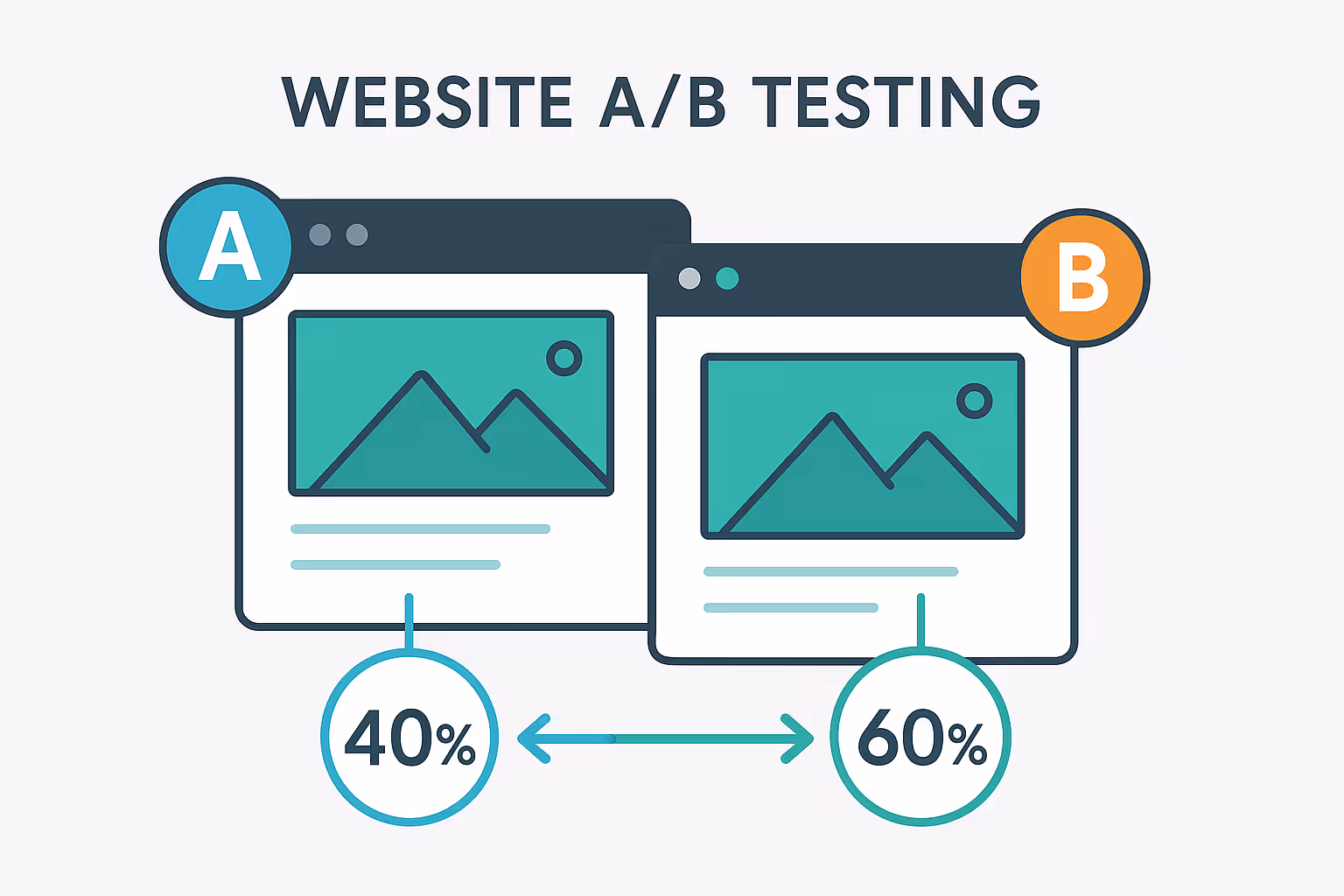
A/B testing allows you to compare two versions of a web element to see which performs better. This could be as simple as testing two CTA buttons—one that says “Get Started” and another that reads “Start Saving Today.” Or it could involve comparing entirely different layouts for a landing page.
Start with high-impact areas such as your homepage, sign-up page, or pricing section. Test one element at a time and ensure your sample size is large enough to yield meaningful results. Focus on metrics that matter—click-through rates, form completions, and time on page—rather than vanity metrics.
Continual testing helps you fine-tune your messaging and design with precision. What performs well today might not tomorrow, so ongoing testing should be part of your long-term strategy.
Complement A/B testing with behavioral analytics tools like heatmaps, session recordings, and scroll-depth trackers. These tools reveal how users interact with your site—where they click, how far they scroll, and what elements they ignore.
For fintech products, these insights are invaluable. They can highlight confusing form fields, low-engagement areas, or CTAs that aren’t grabbing attention. Session recordings offer a replay of user journeys, showing where users hesitate, backtrack, or drop off entirely.
This kind of visual feedback helps identify both obvious and subtle friction points that raw data might overlook. The result is a better-informed design process that leads to higher engagement and improved conversions.
Your website isn't a one-time launch—it’s a living product. To stay effective, it must evolve with your users, your product, and the market. Feedback loops and continuous iteration ensure your site doesn’t just keep up, but keeps improving.
While analytics provide the numbers, qualitative feedback tells you the why. On-page surveys, user interviews, and feedback widgets help you gather valuable insights about user pain points, confusion, or unmet expectations.
For example, asking users “Was this page helpful?” or “What stopped you from signing up?” can highlight unclear messaging or design flaws. These insights often surface problems that metrics alone won’t reveal—especially in complex financial flows where hesitation can lead to abandonment.
Fintech users, in particular, appreciate transparency and responsiveness. Offering a channel for feedback and then acting on it not only improves your product but also strengthens trust.
Once you have feedback, the key is to act on it. Create a structured process for reviewing insights, prioritizing fixes, and deploying updates. This can range from tweaking button copy based on survey results to redesigning an onboarding flow that users found confusing.
Track the impact of these changes through follow-up analytics and user engagement metrics. Even small improvements can lead to significant gains in conversions and user satisfaction over time.
In fintech, where user needs and regulatory landscapes change rapidly, iteration is not optional—it’s essential. A website that continually evolves based on user input is one that stays relevant, trusted, and competitive.
Analyzing real-world examples is one of the most effective ways to understand what makes a fintech website truly high-converting. These sites have not only mastered the art of digital design but also implemented strategic user experience flows, trust-building mechanisms, and clear conversion paths that drive results. Studying them offers valuable insights into what works—and why.
Revolut
Revolut’s website exemplifies sleek, modern design with intuitive navigation and a laser focus on user needs. Its homepage communicates value clearly: users can open an account in minutes, manage their finances globally, and access competitive exchange rates. Strong CTA placement, minimalist UI, and prominent trust indicators—like customer testimonials and security features—build immediate confidence. The onboarding flow is quick and mobile-optimized, which aligns perfectly with the behavior of its tech-savvy audience.
Wise (formerly TransferWise)
Wise sets itself apart through transparent messaging. The moment a user lands on the homepage, the value proposition is clear: low-cost, fast international money transfers. They display real-time rates, fee breakdowns, and savings comparisons right upfront. Their use of comparison tables, social proof, and real customer stories creates a sense of fairness and transparency, key attributes in fintech. The design is simple, user-friendly, and optimized for conversions with frequent, well-placed CTAs.
N26
This mobile-first bank nails the user experience with a responsive and visually striking website. Their design language is consistent and bold, emphasizing clarity and ease of use. Product features are explained with engaging visuals and animations, reducing cognitive load for users new to digital banking. The onboarding journey is efficient—users can start the account creation process within seconds. They also integrate security messaging throughout the site, reinforcing the trust users need when dealing with a 100% digital bank.
Robinhood
Robinhood’s site uses storytelling and simplicity to appeal to new investors. They emphasize democratizing finance and use clean, bright visuals that feel accessible rather than intimidating. The homepage provides immediate entry points into investing, supported by educational content that lowers the barrier to entry for beginners. Their CTAs are direct, and the site maintains performance across devices, contributing to a frictionless experience that encourages conversion.
These fintech websites succeed because they deeply understand their users. They combine aesthetics with clarity, guide users seamlessly through their funnel, and instill confidence with every interaction. Common traits across these successful platforms include:
While your brand and audience may differ, these principles are widely applicable. Whether you’re building a site from scratch or optimizing an existing one, drawing inspiration from proven fintech leaders can help ensure your digital presence meets the high expectations of today’s users.
Creating a high-converting fintech website in 2025 demands more than visual appeal—it requires strategic intent at every level. From building instant trust through design, to guiding users along a seamless conversion journey, each element must serve a purpose. The most successful fintech platforms are those that balance credibility with usability, clarity with performance, and design with data.
Whether you're competing with top fintech companies, launching a new product in fintech India, or scaling globally, your website is your most important conversion engine. Users compare you instantly with global benchmarks and fast-moving fintech startups, especially as AI in fintech pushes expectations higher each year.
This isn't a static checklist; it's a continuous process of refinement and improvement. As user expectations evolve and competition intensifies, your website must adapt—proactively, intelligently, and consistently. When done right, your website becomes more than a marketing tool. It becomes a cornerstone of your business strategy.
At Ballistic Design Studio, we help fintech companies build websites that not only look impressive but deliver measurable results. From custom Webflow builds to UX strategy and performance optimization, our team is equipped to turn your site into a powerful growth engine.
Looking to transform your fintech website?
Contact Ballistic Design Studio to schedule a discovery session and see how we can help you build a site that converts—confidently and consistently.
As digital finance becomes more mainstream, users are more selective and security-conscious than ever. A high-converting website helps you stand out by delivering trust, clarity, and ease of use—three essential components for gaining user confidence and increasing conversions in today’s competitive fintech landscape.
Core features include clear value propositions, fast loading speeds, mobile-first design, user-friendly navigation, persuasive content, strong calls to action, and visible trust signals like SSL badges, testimonials, and compliance certifications. Each element works together to support user engagement and conversion.
SEO drives targeted traffic—people actively searching for solutions you offer. When paired with optimized content and structure, it ensures those visitors are met with a user experience that answers their questions and encourages action. Strong SEO also improves your authority and visibility, which are crucial in the financial services space.
Regularly. Optimization is an ongoing process, not a one-time task. Use A/B testing, heatmaps, and user feedback to continuously refine messaging, design, and functionality. The fintech landscape evolves quickly, and your website should evolve with it to remain effective and compliant.
Yes. Webflow offers the flexibility, security, and scalability fintech brands need. It allows for rapid development, responsive design, seamless CMS management, and easy integration with analytics and third-party tools—making it a strong choice for fintech companies looking to launch or revamp their digital presence.
Ballistic Design Studio specializes in building high-converting fintech websites that blend strategy, performance, and design. Whether you need a fresh build, a redesign, or an optimization plan, we craft scalable Webflow websites that convert traffic into customers.
Ready to elevate your fintech presence? Book a discovery session with us today.


Only valid for-